Last time, I talked about my journey into science fiction cover art and defining my own style. This time, I’m going to go a little further into the creative process and also take a look at a few examples.
I find there’s something more emotive and evocative about a painted/illustrated cover, whether it has been produced digitally or with traditional media. You simply can’t beat the touch of an artist’s hand and their vision or single snapshot interpretation of the story. Science Fiction and Fantasy are also the kind of genres that encourage creativity and spark the imagination – these are the worlds and times when anything is possible.
Your cover art is the first thing any potential reader will see of your book.
Everybody I’ve worked with to date has come to me because they believed that my visual style and approach was right for their book. This is the real starting point.
One obvious concern with any self-publishing project is budget, which is why many authors make the cover themselves or go to one of the many cheap pre-made cover websites. Granted, you can often get an attractive, if generic design, but without much flexibility and no real author/artist relationship. Almost any guide on publishing will reiterate the importance of setting aside budget for good, original artwork.
Put two creative people together and you get a synergy, and there’s nothing more rewarding than the fruits of a brainstorm between an author or publisher and their artist – why cut that out of the loop? The perfect cover will come out of those discussions – even if you’re not in the same country. It is through this two-way creative process that your book gets the cover it deserves.
But even if you have concerns over your budget, I’d say it’s important to strike up conversations with potential artists anyway, and who knows what may be possible.
So far, I’ve found that writers usually already have a rough idea of what they’d like on the cover, but at the same time, they’re also keen to see what angle I would approach it from. So the first thing I do is ask for a synopsis or descriptions of specific people or places.
First comes the ideas and concept art. I usually work up a few black and white sketches – anything from a couple to half a dozen. This quickly gets the project rolling and often triggers other ideas. It also gives an immediate feel for composition in the book cover format. This stage is really the opportunity to explore the various ideas and approaches that could work. Once the concept is agreed on, I then make a start on the final illustration.
Working digitally gives a great deal of flexibility, so once I’ve worked the illustration up to a point where I feel it’s heading well in the right direction, I’ll bounce it over to the client for feedback, and on the process goes from there, with the final stage looking at typography and layout options.
Although some of my own digital artwork has been created on one layer, as if painting on an actual canvas, I prefer to work in layers – one of Photoshop’s great advantages. This way, if each element in the artwork sits on its own layer, it simply gives you much more flexibility when it comes to the composition, making changes or trying different things out.
Every cover project is a different creative adventure – each comes with its own challenges, but also rewards, for everyone involved.
Alice Sabo – Façade
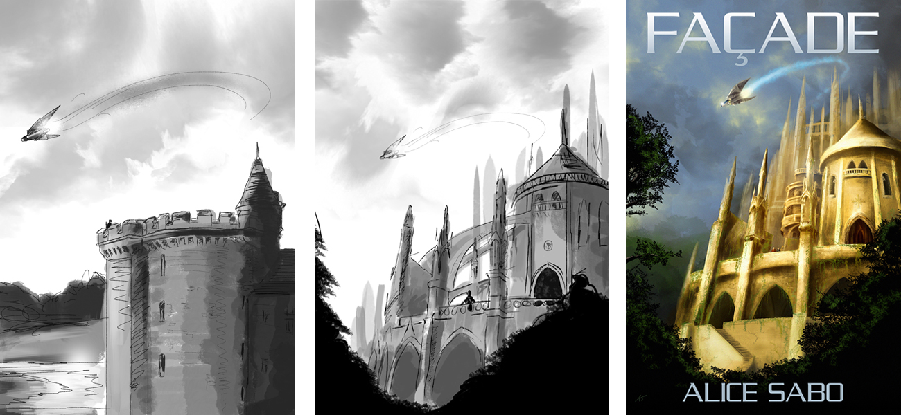
Alice described Façade as a space fantasy, so while SF to a degree, she was keen that the cover art had a more distinct fantasy look to it, with an enormous castle as the main point of interest.
We agreed the cover would feature this huge castle building with a small craft coming in to land, overhead. My first visuals were based on more historical style castles, but these weren’t right for the story – so I revised it, creating something grander, more gothic and dominating, with cathedral-like arches, towers and spires, viewed from a low angle for extra impact.
While small, the ship was a crucial detail. Because of the name of the craft (you’ll have to read the book to find that out!), Alice was keen that it could be almost bird-like in its design. Overall, I wanted to create an image that made you want to step in and explore it… to wander up a staircase or peer in through a window.
Katrina Mountfort – Forbidden Alliance
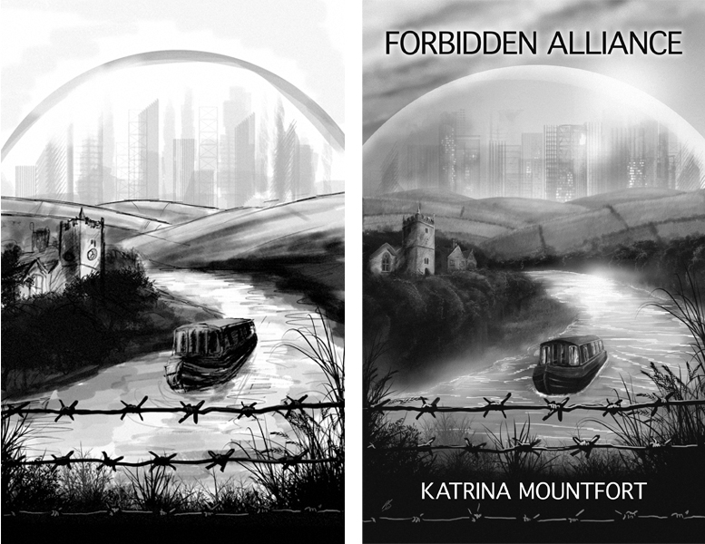 This was the second book in Katrina’s dystopian Blueprint Trilogy. Publisher Elsewhen Press’ own artwork for the first book of the series, Future Perfect, focused on the divide between life inside and outside of the Citidomes that dominate the story. So with a visual style already in place, the challenge for Forbidden Alliance was to expand upon this and somehow incorporate elements of all the different environments featured in the story – including a prison camp, a rural village, a narrow boat on a river and the enormous domed city.
I worked up several rough concept sketches, but I found that incorporating so many elements seemed too much; yet they were all vital things to include, so what do you do? Then it came to me – why not create the scene as viewed from within a prison camp? The simple inclusion of the barbed wire told the viewer everything they needed to know.
As the artwork also needed to be in mono to match that the first book, an additional challenge for me was how to approach the cover without having my usual vibrant colour palette to fall back on! This was easier than I expected – perhaps because of the creative boundary that posed. Tell an artist they’ve got complete free range to do whatever they want, and it’s very easy to go totally off track. Put some simple creative restrictions in place and there’s instantly a direction.
The British Interplanetary Society – Visionary
 This is an example of an existing piece of my artwork being licensed for a cover. I had originally painted Into the Unknown, as a landscape piece showing an Enzmann style starship drifting towards a black hole.
Visionary is an anthology of SF short stories – the book’s editor Terence J. Henley had seen Into the Unknown, and thought that it was a perfect match for the general spirit of the book. However it simply wasn’t a matter of dropping a title over my work – my original painting was landscape format, so in order for it to work at its best as a piece of cover art, I reworked it into portrait format. This is one example of the advantages and flexibility of having produced the original piece in layers.
Helen Claire Gould – Floodtide
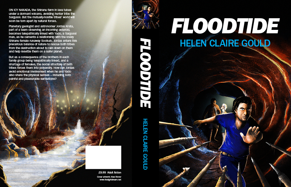 I met Helen at Novacon (the UK’s longest-established SF convention). I was exhibiting my artwork, and Helen was promoting her first SF novel, Floodtide, which she had published as an ebook with her own painting as the cover. After the convention, we kept in touch and Helen told me that she was planning a print version of the book that would have a different cover, which she asked me to produce.
Helen was keen to show a scene from the book, rather than having me re-interpret her original cover. Floodtide is a hefty book, with a lot of characters and environments. However the majority of the story takes place in a complex of interconnected lava tubes and caves on the ice planet Naxada. Helen’s expertise in geology forms the basis of the science in the story, so it was important to show this setting in the artwork. We decided that a general view of this mysterious underworld would work for the back cover, with an action scene on the front, featuring the story’s three pivotal characters.
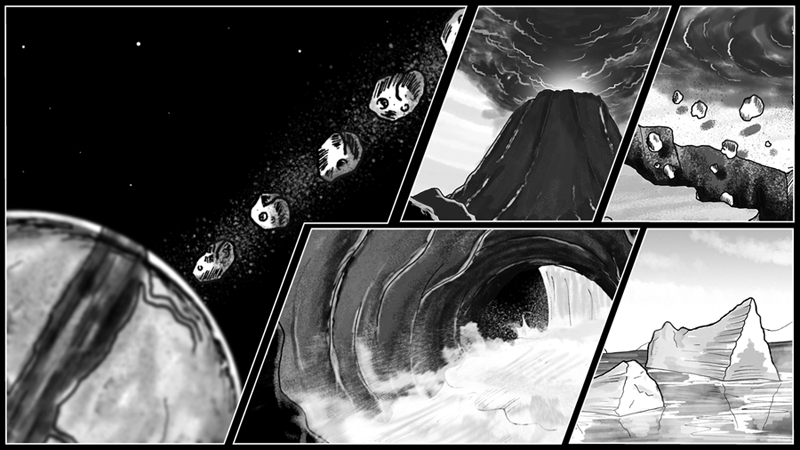 After the cover artwork was complete, we set about creating a teaser film. This we decided to deliberately make in a mono comic book style, comprising various characters and scenarios from the book. Helen’s son provided the voiceover, while Helen put together a screenplay. My job was to illustrate everything, which I rendered in ink and finished digitally. I then edited the whole lot together and composed an original piece of music for it. I also animated many sections of the teaser, which really brought the scenes and characters to life, giving the Floodtide teaser a very distinctive look.
Watch the Floodtide teaser here:
https://youtu.be/WF8UZwfHuSQ?list=PLftgshIem9isD1i_RTX_tPxL6bB7H85hC
It is always an exciting and proud moment to see my finished artwork sitting on the cover, knowing it is going on its journey to help promote the book. Self-publishing has allowed projects like these to happen, and I’m honoured to have met some great people and excellent writers in the process.
Alex Storer is a graphic designer, illustrator and musician, from Sheffield, UK. He is also honorary musician for The Initiative for Interstellar Studies.
Website: http://www.thelightdream.net
Twitter: @TheLightDreams
Facebook: facebook.com/thelightdreams